data.org
How we reimagined a digital platform that helps build the field of data science for social impact
The challenge
data.org wanted to better serve social impact organizations, particularly those that aren’t immersed in the field of data science. To do this, they needed to present curated and relevant resources along with content that provides context for the uninitiated.
The Solution
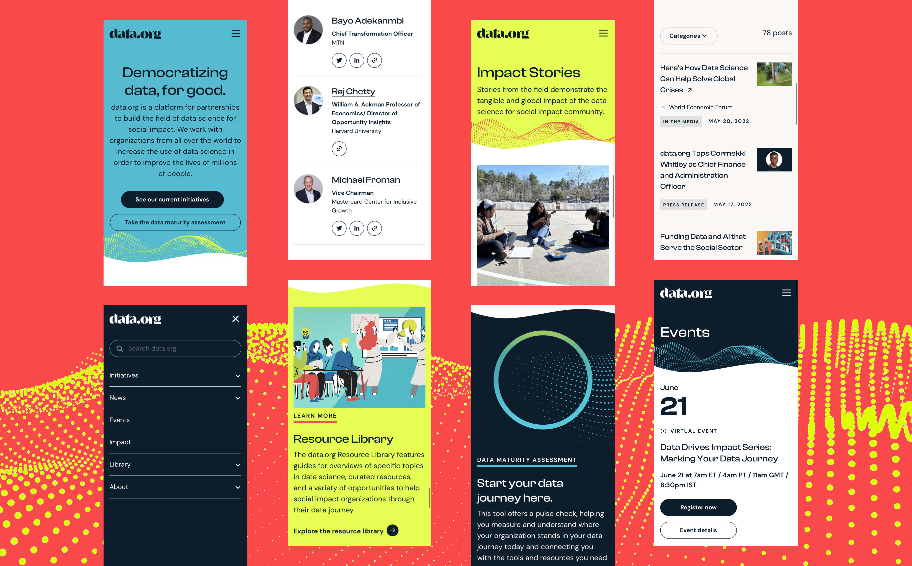
Design and build a WordPress website featuring a robust, easy-to-navigate resource library and the editorial tools necessary to build custom post types for everything from case studies to community member bios.
Using design to stand out from the crowd
Phase 1 of our work on this WordPress site began as data.org was undergoing a rebrand by Matter Unlimited. This meant we had to develop most of the design system in wireframe fidelity and then add visuals at the end of the buildout. In the meantime, we focused on content hierarchy, layout, and UX.
Matter Unlimited defined the visual guidelines around the new data.org brand, including the wordmark, color palette, and typefaces. After a successful hand-off, we got to work translating the budding brand into a user interface design language that would support both editorial and utilitarian content.
To differentiate themselves in the data science and social impact spaces, data.org lobbied for a visually vibrant brand, which handed us a ton of opportunity with design. In addition to a bright palette of accent colors, we introduced optional curved edges to content patterns as well as decorative dots, or particles, to create a sense of fluidity and loosely mimic a starling murmuration (representing a swarm of autonomous organizations collectively using and sharing data).
With a number of visual elements at their disposal, we wanted to make sure content editors had flexibility in where and how they could be applied. So we gave them the ability to choose colors, patterns, and curve behavior for each instance of a content pattern, letting them influence how content is presented from page to page and within a single page or post.
All in all, it was a quick turnaround—just three months from design to launch.


Creating a resource library that’s actually useful
data.org was keen to create a library of resources for social impact organizations that would increase their capacity to leverage data science for social good. But they didn’t want to create a redundant link repository.
After testing click-through prototypes of our library concepts and extensive user interviews, it was clear that the flat structure we originally envisioned, which let users make their own path, wasn’t effective. It turns out people were often unsure of what to search for or browse when questions about why and how their organization could leverage data went unanswered.
We pivoted to a use case-driven library that has dozens of individually sorted and filterable tools, templates, and opportunities as well as guides that provide background and context for those resources and the plausible outcomes that can be achieved with their help.
Overall, our goal was to provide data.org’s content team with the right tools to create impactful reading experiences. Content patterns for related guides and resources, quotes that link to an author’s profile, related events, and related stories allow editors to break up big chunks of text by surfacing on-topic content that helps readers dig deeper into a specific subject. The result is a resource library that’s engaging and credible.
Building on WordPress to meet their need for speed
As an emerging platform, data.org was looking to boost engagement on their site, and sites that load fast are more likely to hang on to visitors. We were able to significantly enhance the performance of their website.
-
%Page Load Time Improvement From the Previous Year, Going From 7.7 seconds to 4.4 seconds
-
%Increase in Page Views Year-Over-Year
-
%Increase in Site Visits From the Previous Year
-
%Decrease in Bounce Rates From the Previous Year
