
I don’t think there’s an industry with more resources for sharpening your chops than design. We’ve got galleries, tutorial sites, and brilliant minds giving free wisdom away everyday. For all of these amazing resources, sometimes it pays to step away from the monitor and find inspiration and education elsewhere.
Before getting into the design world, I worked in kitchens. I watched Chefs tackle problems that echo in my day to day life as a web designer. They have a similar wealth of education to reference, and a desire to use that knowledge to pave new ground. They combine disparate elements to create a whole. They work with teams of people with different skills to orchestrate an intricate process. They are forced to balance the objective with the subjective and deal with human irrationality. They’ve got papaya instead of pixels, pots n’ pans instead of pencils n’ pens, but essentially similar situations.
Process
Cooking rarely starts with an empty cutting board. Chefs have experience, knowledge, and recipes to start them off. Good chefs rely on this education and history to inform the food they cook. Great chefs leap off that education and history to knew and exciting flavors. The key is that Good Chef’s and Great chef’s don’t start at the bottom of the ladder with every meal. In French cooking they are 5 mother sauces. Chef’s don’t have to reinvent them each time they want to develop a new recipe. They know each sauce intimately, identifying its’ strengths and weaknesses, when they sing and when they stink. You should be begin each design project with the same base. Develop your library of best practices and UI patterns, your mother sauces. Learn which patterns are appropriate for which solutions. Boil these patterns down to their essential qualities; content layouts, typographic hierarchies, color palettes, and surface treatments.
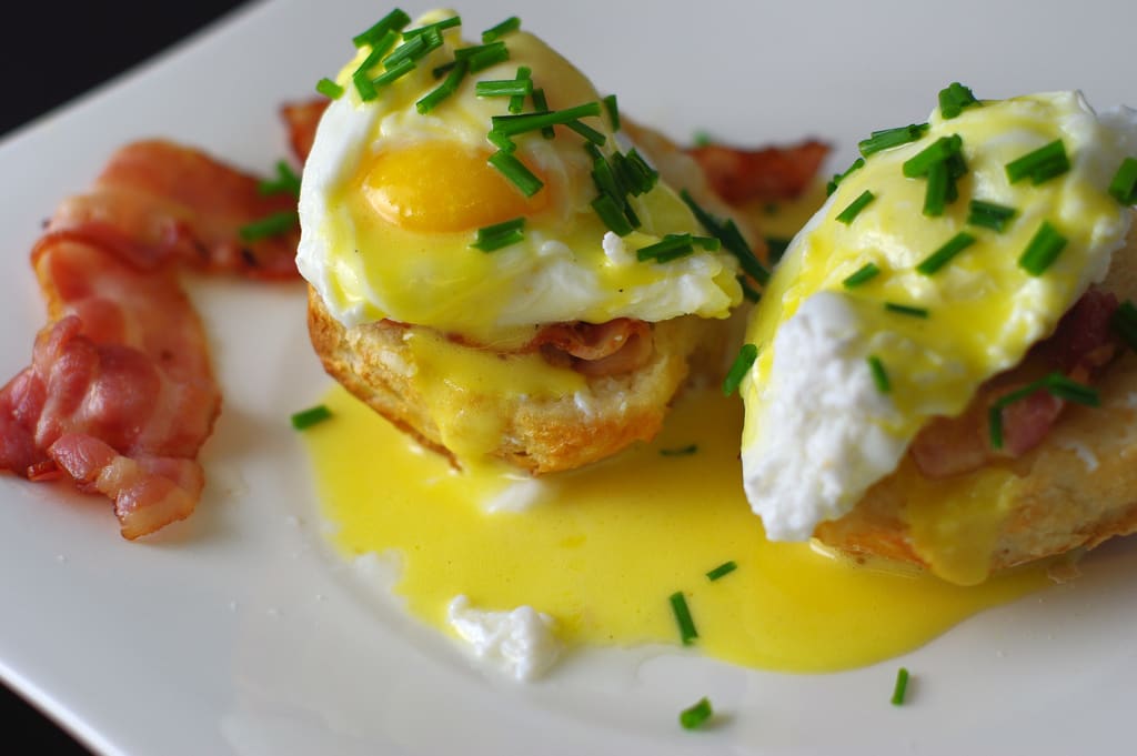
When you know this library well, you’ll be able to quickly cull this cookbook for solutions to design problems. You won’t need to reinvent the wheel with each project. You’ll be able to get to solid design solutions faster and more efficiently. Your work will be consistently good, and you’ll be able to produce 80% of the necessary work in 20% of the time. If you stop there, you’ll be a good designer. You can use the time you saved relying on your previous knowledge to go to the movies, or spend more time with your family. Perhaps you can do more work and make more clients happy. Think of it as the perfect Eggs Benedict (hollandaise being one of the 5 mother sauces). Lots of people love Eggs Benedict and if you can produce a solid one every time – you’ll have lots of happy clients.
But… your cookbook can become your jumping off point. The recipes you have at your disposal can be come the basis for new and exciting approaches. This is where the great chefs and great designers are born. You’re presented with a design problem. You know and have at your disposal the tried and true solution. Because that’s in your back pocket, you’ll have the freedom to flip it around, take it apart, and put it back together in a way that people haven’t previously seen. You’ll have the freedom to design something new and innovative.
Harmony
A good chef must pay a great deal of attention to the relationships between items. They do it at the menu choosing items that complement each other. They do it at the plate level as well, focusing on ingredients that bring out each and highlight combinations of flavors. Our job is no different. When designing for the web, examining the relationship between elements will make the decision process easier. A typeface may be beautiful in it’s own right, but it’s relationship to the tone of writing, color, and layout are what make it the correct typeface for the job.
Here’s the rub, we’re used to examining the relationship of our decisions against the mission or the the brand. Does this color communicate our ‘message’? Is this typeface communicative of our personality? How often do we say, “This type face is awesome, but it’s drawing attention away from our illustrations?” Or “let’s restrain our color pallet to allow us to make more dramatic choices in our copywriting. People may remember the single delicious ingredients that you choose, but the goal should be an entire meal. A successful design project has a point of view. The relationship of it’s elements is what will communicate that point of view. Where some meals are about highlighting specific flavors, and some design problems are about expressing a singular message or action it may be appropriate to slather your work in sriracha, other projects require a more nuanced and structured approach where each flavor interacts and grows with its fellow ingredients.
Juxtaposition

Ever eaten a piece of salted caramel? How ‘bout chocolate covered bacon? Sushi with Cap’n Crunch? Great Chef’s are adept at seeing the relationships between items that don’t traditionally go together. I was working on a project this morning for an organic dog food company. The marketing folks had drummed up a revolutionary styled campaign calling people to join the fresh food movement. I started dropping in Futura to capture that dramatic and solid stance, but it was coming off too aggressive, too much. So what to do? We introduced a fun quirky hand drawn font (courtesy of the Google Font API no less) – the exact opposite of what we had been going for. The quirkiness of the hand drawn heightened the drama of the Futura, and allowed us to use far less of it to make the point. It played the foil; the chocolate to the Futura’s tomato; the pickles to the peanut butter, BBQ pork to the glazed donuts (seriously, I just had this at a taco cart while at SXSW and it was mind blowing).
Keep your tools sharp
Great chefs spend a great deal of time taking care of their tools. Are you trying to design with a dull knife? I’m not saying to go buy the latest version of photoshop. Are you actively educating yourself and researching your industry? Are there new design patterns & code innovations which shape how you design? What did you learn last week? If you can’t answer that, you need to sharpen your tool-set. I find myself continually revisiting and rereading the foundations of my education (my design education came solely from the library and the mentors I’ve had). In a few minutes you can find a generator for any number of flexible grids – but I like to draw mine out with every new project. It’s worth it to go through the motions. Do the due diligence. This continual return to fundamentals, and attention to the basics is what keeps your work consistently good. It staves off the inevitable trend towards corner cutting that comes with being busy.
No one has made a delicious meal with ‘I can’t believe it’s not butter’
Much of web design is about building systems and structures. We are often designing shells for other people to breath content into. We design the yellow cake and leave the client to fill our proverbial Twinkee with life. Focusing on structure and UI, it’s often easy to glaze over the quality of our ingredients. The explosion of affordable stock photography has made it easy for designers to quickly gloss over their imagery. Odds are the stock photo you purchased for $5 could use some color correction, a new crop, and some retouching. Sure you could toss it in the mix, and everything would come out fine, but some attention and care for the small details are what really make a piece work. With the current renaissance of type on the web, there’s no excuse for not using the finest of fonts. The same way that chefs pour over artisanal olive oil, choose your type with care. Gone are the days of choosing the lesser of evils.
I’m hungry.
When you’ve run out of css galleries, take a look at your favorite cafe and see how they approach things. Maybe next week we’ll examine accountancy, plumbers, or the hari krishnas.
I’m off for a snack. Catch you later.