
We live in a culture of instant gratification. If a website doesn’t load fully in seconds, we express frustration (or maybe occasionally rage) at the speed of the connection. Once the page is loaded, we expect to be able to find information or complete a transaction just as instantaneously—or we might give up entirely. As BigCommerce points out, “Customers expect to be able to find the information they’re looking for in a click of a button and in the blink of an eye. When this isn’t possible, frustration brews, and this can lead to you losing a sale or even losing a potential customer forever.”
When designing navigation, the stakes are high. The objective is to help your users achieve their goals as efficiently as possible—which of course is easier for some businesses and sites than for others. Think of a simple restaurant site. A user’s goals are likely pretty straightforward—make a reservation, figure out opening hours, find a location, browse the menu.
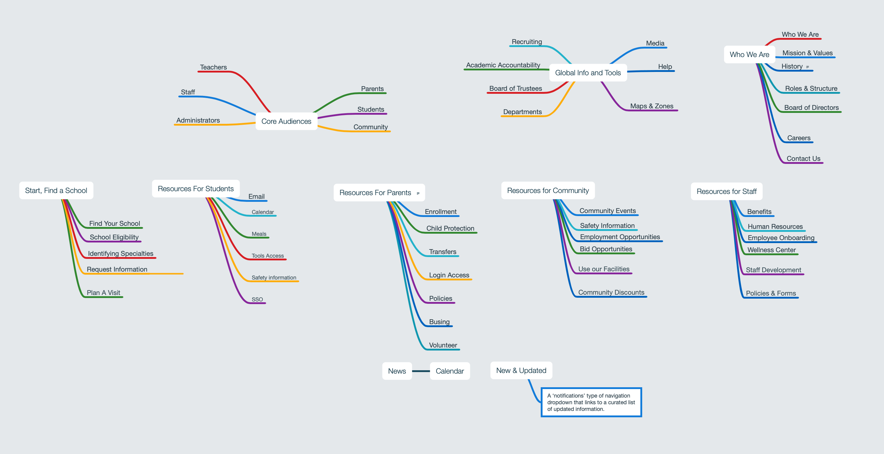
But what about a more complex organization—say, a multi-brand corporation or an organization with multiple departments, servicing a range of audiences with their own unique needs? Those sites typically have an overwhelming amount of content. Consider the typical university’s homepage. Their website is likely to include content—and pathways to content—for current students, prospective students, parents, faculty, staff, alumni, and donors (to name just a few). That’s a lot of pages.

Designing Navigation: The Basics
When designing website navigation for an organization of that complexity—or any website, really—the questions become:
How do we get the user where they need to go as efficiently as possible?
Simply put, through research and analysis. Identify the most common and important tasks and pathways by digging into site analytics and interviewing users. On which pages are users spending their time, and for what purpose? How are they getting there? Prioritize those tasks and pathways and order them accordingly.
Your primary navigation should advertise what your site offers, while also being as focused and organized as possible. Consider whether a user’s first glance at your main nav truly reflects the primary value your site offers to your core audiences. If that isn’t immediately clear, your nav needs a revamp.
Make sure to include secondary and in-page navigation patterns to support ancillary paths within key site sections—for example, submenus, breadcrumbs, or sidebar navigations. This not only helps the user navigate around the site but also gives them an idea of where they are within the site.
How do we design navigation for those who browse?
In other words, how do we support a user who doesn’t know where they want to go? Again, it starts with user empathy. Be introspective and identify the problems your site solves and the value it brings to your core audiences. Use this information to identify navigation items that will solve the most problems for the most people.
Determine if role-based navigation is an appropriate method of self navigating. This can be particularly helpful in the higher ed example included above because it triages users into major user groups that are easily self-identified. Prospective students need entirely different things from a website than faculty members; by removing superfluous nav items that will only distract them from their intended pathway, you make it easier for users to get to the information they need, faster. That’s the goal, right?
Use the most easily understandable label for each navigation item, considering whether you need to use a verbatim page title as your navigation label—for example, a user can be pointed to the Office of Career Services via the nav item “Careers” rather than the formal office name. Make sure each navigation item is differentiated enough from other labels in the navigation so the user knows exactly what they can expect from each option.

A Few Extra Principles To Keep in Mind
Don’t confuse navigation with information architecture
IA is about how you organize content; navigation is about user flow through a website. They’re obviously related, but they’re not the same thing. To rely solely on your site map as your primary nav, with hierarchical dropdowns within dropdowns, is to skip the step of ensuring your navigation speaks directly to and supports your user’s objectives. Navigation should always speak to the user’s natural needs first. For example, a university’s application process may fall under an Admissions department or Academics office. However, more often than not, you’ll come across a top-level “Apply” link within a primary navigation. And for good reason—if access to that page is buried exclusively under administrative departments, you’re creating obstacles to enrollment, one of the tenets of a university site.
Beware cognitive overload
Less clicks is better, we’ve all been told. You want to deliver your user to their desired outcome in as little time, and with as few clicks, as possible. But sometimes minimizing clicks can lead to a more confusing user experience. In fact, if saving a click comes at the cost of navigational simplicity, it can actually slow a user down: “Putting everything in front can very well create a lot of ruckus on the interface itself, making it harder for the user to actually look for the intuitive solution that they actually expect from the system.” This “ruckus” can lead to cognitive overload, or when the “brain begins to slow down or even abandon the task at hand when it receives more information than it can handle.”
If a user has to spend more time looking through an overwhelming navigation to decipher where they’re supposed to go, saving a click or two amounts to a false economy.
Consider how much information—and how many navigation items—a user can comfortably process in a short period of time, and plan your nav accordingly. They won’t mind an extra click if the steps to get where they’re going are easier, quicker, and more intuitive.
Simply put, be gentle on your users’ brains. They go through a lot in a day.
Think in groups
Consider organizing your nav by identifying natural groups of items. For a higher ed institution, that might look something like this:
- Audience-based navigation (Parents, Students, Faculty)
- Task-based navigation (Apply, Register, Contact)
- “Brochure” subjects, informational navigation, or by department (Academics, Finance, Housing)
Create iterations that prioritize one over the others, then discuss and test the strengths and weaknesses of each approach. Remember to keep in mind what goals or questions your users are coming to your site with, and what language they’re likely to be using. For example, a prospective student wanting to apply to a specific program may not be thinking in terms of “Academics,” so department-based navigation may not be appropriate.
Think beyond static links & basic search
Beyond your navigation links and global search bar, there may be other tools that can aid in discovery and user flow. St. Olaf features a Tools menu that introduces persistent and robust way-finding features like an A to Z list and a Directory. Often relegated to their own standalone pages, these fully-featured tools are instead accessible on every page from the primary nav without dominating the navigation area.
St. Olaf employs commonly used utilities such as a Directory and a Calendar directly within a Tools section in the nav bar
Think small
Not every project needs to be mobile first, but you should always consult any available existing analytics around what devices your users are browsing on. That being said, the process of prioritizing and narrowing down nav items for small screens can inform prioritization strategies for larger screens and can even damper the impulse to overload your nav with too many items.
Test, test, test
If you’re going to prototype and user test anything, start with your nav elements. You can do this two ways: by testing your information architecture (are our categories, labeling, and prioritization correct?) and/or testing your user interface (did we place things correctly?).
To user test your information architecture, try using this Card Sorting method from Nielsen Norman Group or this Tree Testing method.
To user test your UI, we recommend using InVision as a prototyping tool, which will allow you to:
- Click through static screens
- Try out mobile- and tablet-specific prototypes that can be viewed on devices
- Use sticky headers, overlays, and transitions
- User test with the prototype

The most important thing you can do when designing navigation (and designing websites in general) is to remember that it isn’t really about your organization. It’s always about the users and what they need from you most. Take the time to understand those needs and make them central to everything you do, from answering the phone, to wayfinding in your building, to structuring your website navigation. Help them find what they need easily, and they’ll most certainly be back.