
Everything you see here represents a new step forward for Modern Tribe. Over the past 9 months or so, we’ve been working patiently to unveil a new identity, a new website, and a bolder Tribe. At times it’s been hard to contain our excitement over it all, and we’re so stoked to be able to finally share it with the world. This new identity is part of an internal rebranding that represents who we are and where we’re headed as a company.
The Evolution of the Tribe
The new brand serves as a marker for where we are in the evolution of Modern Tribe. What started off quite literally as Shane & Peter has grown into a robust web agency of 50+, a Tribe that spans 7 countries across 3 continents as of this writing. As we’ve grown, it’s become increasingly difficult for Shane, Peter, and Reid to be the brand all by themselves. We needed something that would represent who we are to the world and give us some grounding as we continue to grow and evolve.
This rebranding effort was also the first undertaking of our new design department. Though many of us have been working together for years as freelancers, part of Tribe’s evolution has been to transition many of its core members to full-time staff. This security and singular focus has allowed us to start working toward long-range initiatives like this new website and rebranding that affirm the design-led focus of Modern Tribe’s work.
But we didn’t want to throw everything out and start over. Modern Tribe has built a tremendous amount of brand equity, especially in the open source space, and we wanted to make sure that our rebranding elevated and amplified that equity instead of abandoning it.
Quality Products, Balanced by Living Quality Lives
One of the defining characteristics of Modern Tribe is its focus on lifestyle and work-life balance. We started as a group of freelancers, and that freelancer’s spirit of self-determination still pervades even as we grow. Meetings are just as likely to be answered from some new destination in the tropics as they are from a stuffy office or coworking space. One of the great perks of being distributed is being able to work most anywhere, and we leverage that to ensure that we’re living intentionally with every day we get.
I started freelancing because I was determined to be able to surf every day.Shane Pearlman Founding Partner

This focus on intentional living is the defining characteristic of Modern Tribe. We know that we can do our best work as a company when we’re personally fulfilled and fully able to follow our own paths in life. The freelancing lifestyle tends to attract people with strong outside passions and interests, and indulging those passions is part of Tribe’s DNA. We wanted that to be evident in our brand and strove to create a visual identity that didn’t feel techy, intimidating, or like work.
This brand direction not only works to affirm who we are internally, but also to set expectations for our clients. Clients are people too, and we believe that people would rather have fun and be successful in their job that to feel intimidated, unknowledgeable, and not in control. We work side-by-side with our clients as partners to ensure that we produce work that solves problems and makes them heroes within their organization. We wanted the brand to convey that working with Modern Tribe is different, and that embarking on a website, new product launch, or design challenge doesn’t have to be stressful. It can even be fun.
Fitter, Happier, More Productive
When we embarked on this redesign, the totality of our brand identity was a light blue wordmark set in luxuriously-spaced Gotham. There weren’t any glaring problems with it, but it wasn’t really saying anything either. And with only one piece to work with, the brand lacked any significant depth. Allcaps Gotham everything.
And Gotham itself had reached a level of ubiquity where it was as easily identifiable as Helvetica or Times New Roman. It felt like “another one of those” and didn’t really capture the unique spirit that Modern Tribe embodies. Because we were looking to refresh the identity and not start from scratch, we wanted something that would allow us to keep the same basic look of the wordmark, but would be friendlier and more distinct. We went with Freight Sans as the primary building block for this new identity.
Freight Sans is a superfamily that offers a lot of variety among its many weights. It has a friendly and approachable voice that fits well with what Modern Tribe wants to communicate. It’s a great middle ground between geometric and humanist styles–sleek and sophisticated, but at the same time warm and friendly. These distinctions are amplified as you pass through the different weights, with thinner weights feeling increasingly modern and elegant and thicker weights fun and conversational. We worked the extremes of this contrast to create a suite of stylings that tell the range of Modern Tribe’s story and offer a lot of contextual flexibility while still feeling on-brand.
For the wordmark, we customized Freight Sans to create a look that evokes the same feel as our legacy mark, but with a refreshed and friendlier tone.
Making the Mark
Another initiative of this brand refresh was to create a mark that could stand alongside the text to make the logo feel a bit more complete. Bonus points if it could stand alone as well.
Creating the mark was truly a team effort. After repeated frustration with combining Ts and Ms in every conceivable fashion, we gravitated back to a mark on one of the first mockups that Kyle created for this website. It was a fill-in, placeholder mark but it had a great feel. The colors, which spread our original Tribe Blue off into an analogous color palette that bled into green, were bold and lively and the form was simple and direct. I took that mark, reoriented it, changed the geometry quite a bit, and refined the color palette. It was close, but still not there. It felt too rigid and stiff. Reid took it and angled the sides inward and we knew we had found the mark.
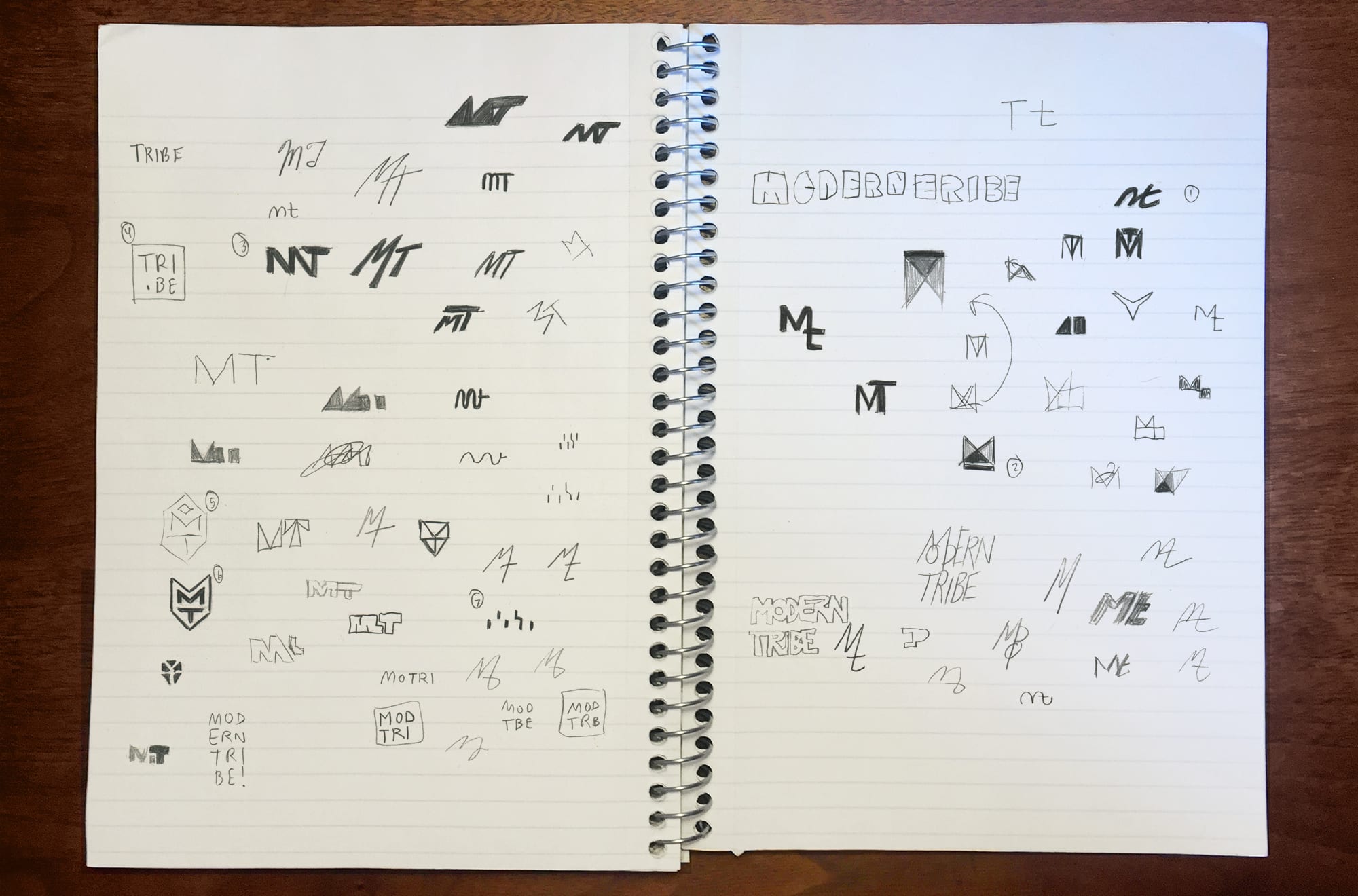
One of the guiding principles of design here at Tribe is to create a flat internal structure where we can all focus on finding the best ideas and not be concerned with titles or chain of command. It’s fitting that our mark came to exemplify this process.
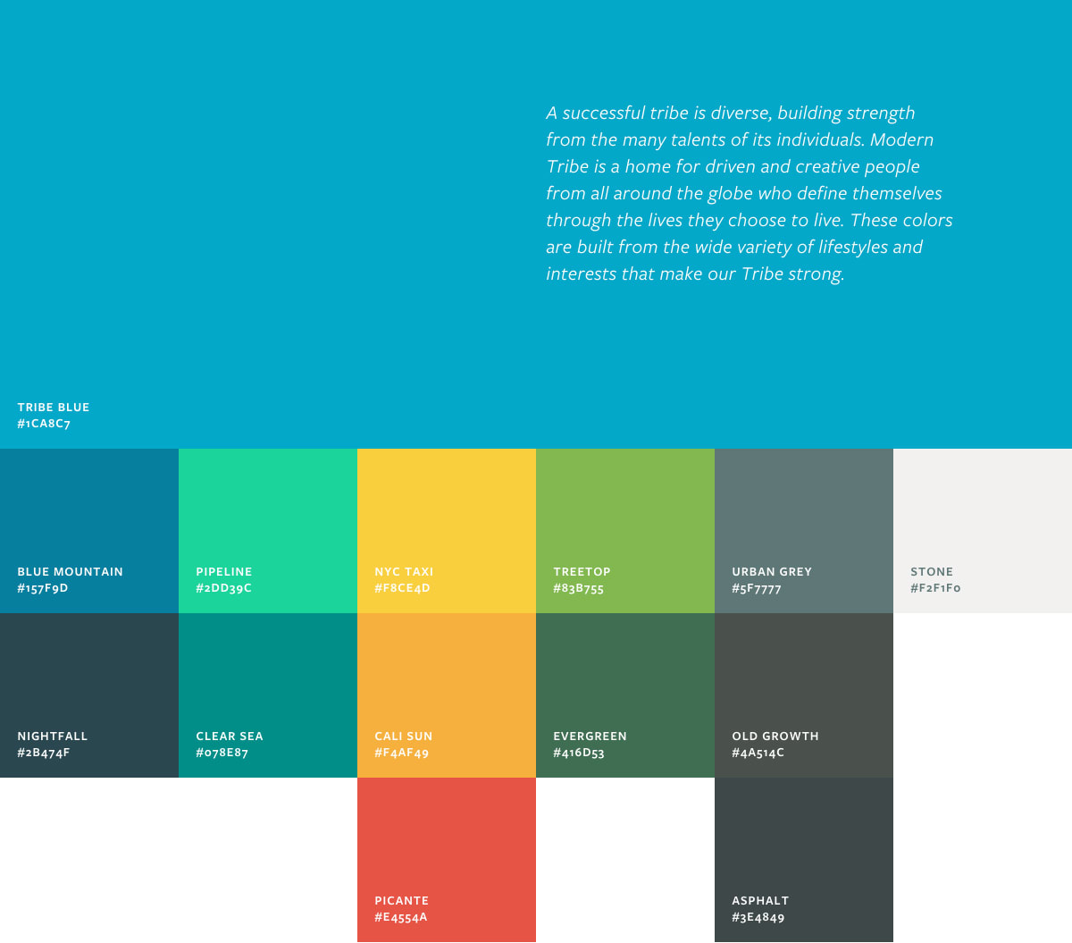
Expanding the Color Palette
After being trapped in monochrome for so long, a robust color palette was another important aspect of the new identity. The logo itself expanded the color range somewhat and was a breath of fresh air. The blue-to-green spectrum really played off our Santa Cruz, California roots, but we wanted to push that even further in a way that captures the breadth of interests and environments here at Tribe.
Our passions cover a lot of bases–from urban running to cooking to camping and living off the grid. And our locations are equally diverse. We built off this diversity to create a varied color palette that represents our individual qualities but still works in harmony with each other. To do this, we compiled found images as well as personal photography from Modern Tribers to get a full view of the range of lifestyles and environments and then distilled them to key colors that represent the Tribe as a whole.

To Identity and Beyond
The Modern Tribe refresh has been an overwhelming success internally, and we hope that it helps us communicate who we are a little better to the world. It’s been incredible seeing the internal resonance of a lot of the ideas behind it even when we didn’t explain the thinking that went into it. It just feels like us.
And the mark, which was originally intended as a supplement to the logo text, has grown legs of its own. In use, it stands for Modern Tribe and frees us from always having to use a long line of text that doesn’t break very well. We’re finding that the mark allows us to be even more flexible and nimble with the brand than we had imagined.
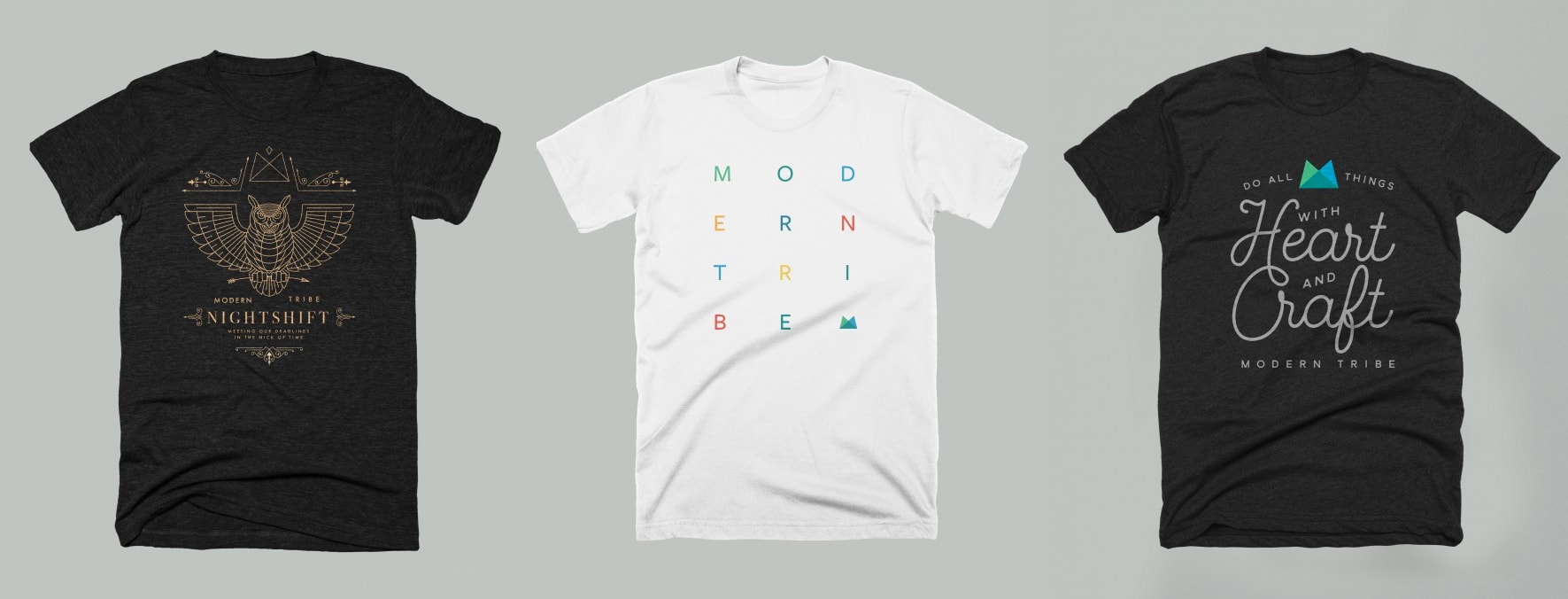
Our identity is certainly a work in progress, and no job like this is ever truly done. To ensure that it grows and evolves gracefully, we’ve created a living style guide that provides logo files, colors, and type treatments for the staff to pull from as needed. For the holidays we created a special store for the team full of Tribe swag–from shirts and hats to pillows and tights. It’s been so much fun pushing the identity and testing its flexibility in new applications. So far, it’s been holding up quite well.
Long live the Tribe.