The new Modern Tribe website is live, and the only thing that would make us happier is a lifetime supply of tacos delivered to our doorsteps.
The site is everything we imagined and then some, brought to life by a team of incredibly skilled and passionate project managers, designers, developers, writers, and QA analysts over 18 months, starting and stopping as we navigated the complexities of a global pandemic.
We’re the victim of two sad realities: The cobbler’s kid has no shoes, and you’re your own worst client. Somehow the team managed to navigate a real jerk of a stakeholder 👋 and produce something that feels very authentic and meets our goals.
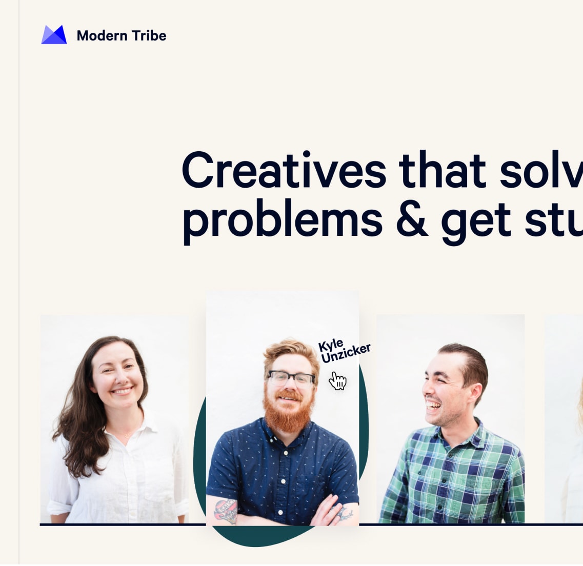
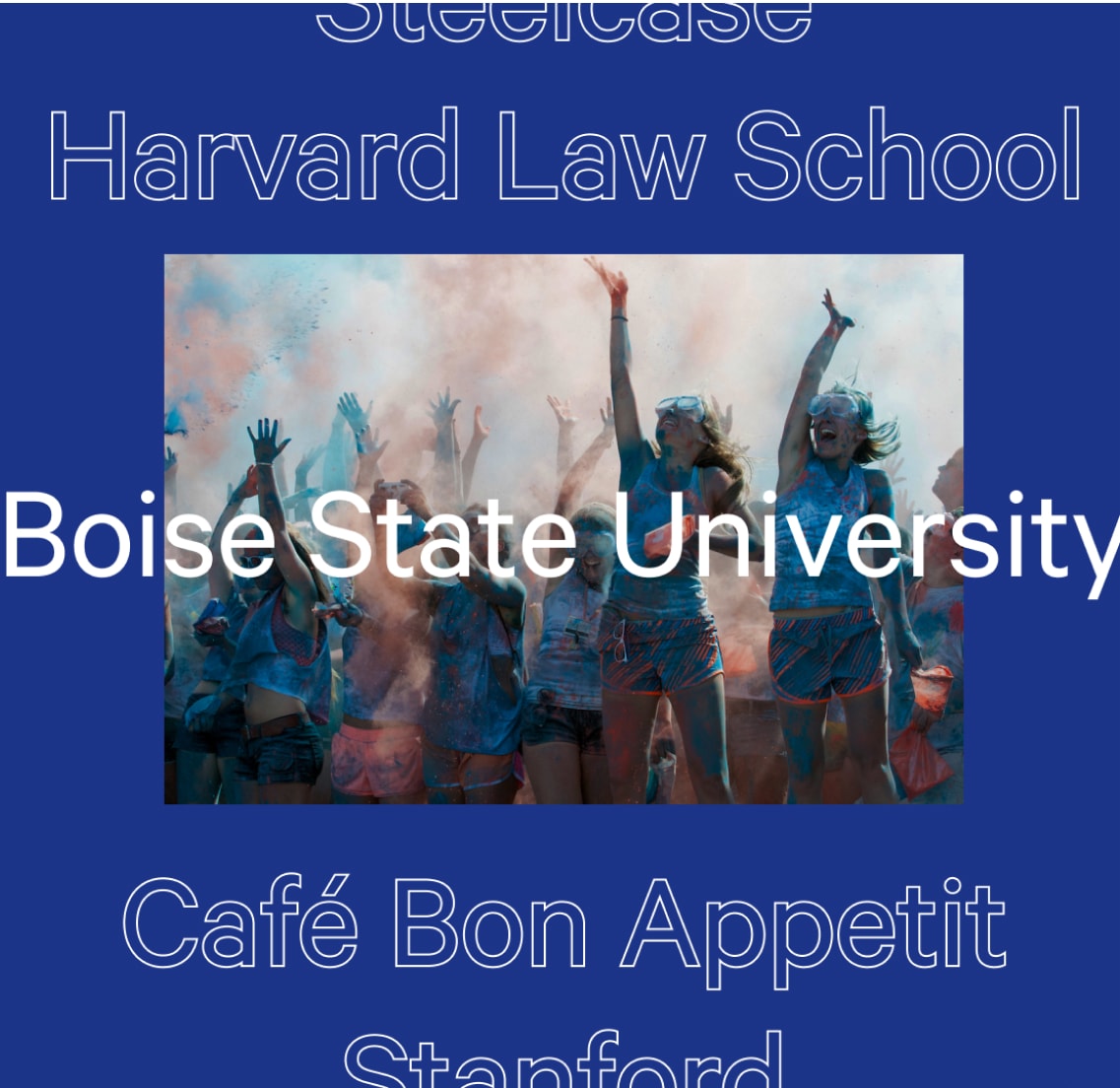
The old site was extremely “people first.” Our strategy was to celebrate the talented folks who work here—our not-so-secret-sauce. We want to keep that spirit alive and one of the best ways to celebrate those folks is to show their work. Our new site highlights the exceptional digital solutions we produce for our clients and all the kooky weirdos who make it happen.
We’re also continually looking at our communications to ensure that they reflect our DEI efforts. This new site was a chance to wholesale update our language and visuals to help achieve our goals of recruiting diverse talent, celebrating the unique voices of our team, and ensuring we’re an equitable and inclusive company. This is and continues to be a work in progress.
From WordPress to Headless and Back Again
It’s been six years since we last launched a totally redesigned Modern Tribe site. It was truly headless and broke new ground with the build approach. There were no libraries and starters when we shipped it. The REST API itself was still in its infancy.
Being on the bleeding edge is fun and pushed our design and engineering limits. We learned a ton that helped us successfully build headless and decoupled systems for our clients. Six years later, “headless” is still a buzzy word. The reality is it’s not the straight win that much of the marketing material purports. We’ve got a cost-benefit analysis coming to help clients make the right strategic call, but the TL;DR: The business case for headless is nuanced.
Our site is our place to play—and we wanted to experiment again. This time around, we wanted to dogfood our new approach to Gutenberg and our new design system. We wanted to push the boundaries of what’s possible with the WordPress editor. Is Gutenberg going to be an anchor or a springboard? Can our creative teams run wild or do we need to be roped in?

We’ve been doing modular content for a decade now, and our headless site was built using our mature content management suite of tools. Migrating from our modular content to Gutenberg was pretty straightforward since the content models are the same. Mapping our legacy panels to our new blocks enabled us to script most of the migration work, with a touch of manual cleanup wherever necessary.
As one of our primary content creators, I can say the Gutenberg experience powering the new site is…okay. I say that as someone with, perhaps, unreasonably high standards. It’s not the train wreck that much of the WordPress community makes it out to be, but it’s still got a ways to go before it feels like a delightful tool that helps you create great content.
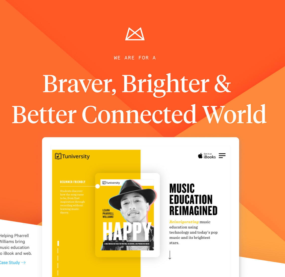
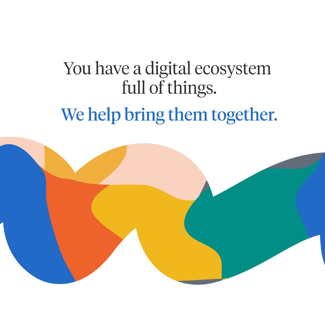
Early Website Concepts


A Look That’s as Vibrant as the People Who Made It
Of course, we can’t talk about our new site without talking about the look and feel, which is bright and has lots of movement—more than anything we’ve ever attempted for ourselves.
“We knew touching the brand visuals would be a balancing act of protecting the rich history and brand equity we’d established—and frankly, adored—through the years, while ensuring we were pushing ahead and elevating the brand to align with our audiences, values, and voice,” says Sarah, a principal designer.
Motion elements range from the simple—like gifs—to the complex—namely our “noodle,” a feat of exceptional engineering that winds down (and back up!) the Services page as visitors scroll, deftly swerving around text dynamically. We leaned into video, as content but also as textural elements.
Our design goals were twofold: to push the limits of our internal system, ensuring our tools can produce really interesting and bespoke visuals while leaning into accessibility and efficiency, and to show off our top-notch work and talented team.
Overall, we wanted the site to feel true to us. It’s fun and lively and sometimes adorable. It’s not hip, it’s not cool, but it’s beautiful and smart and crisp.
